Legend for haplotype networks in R
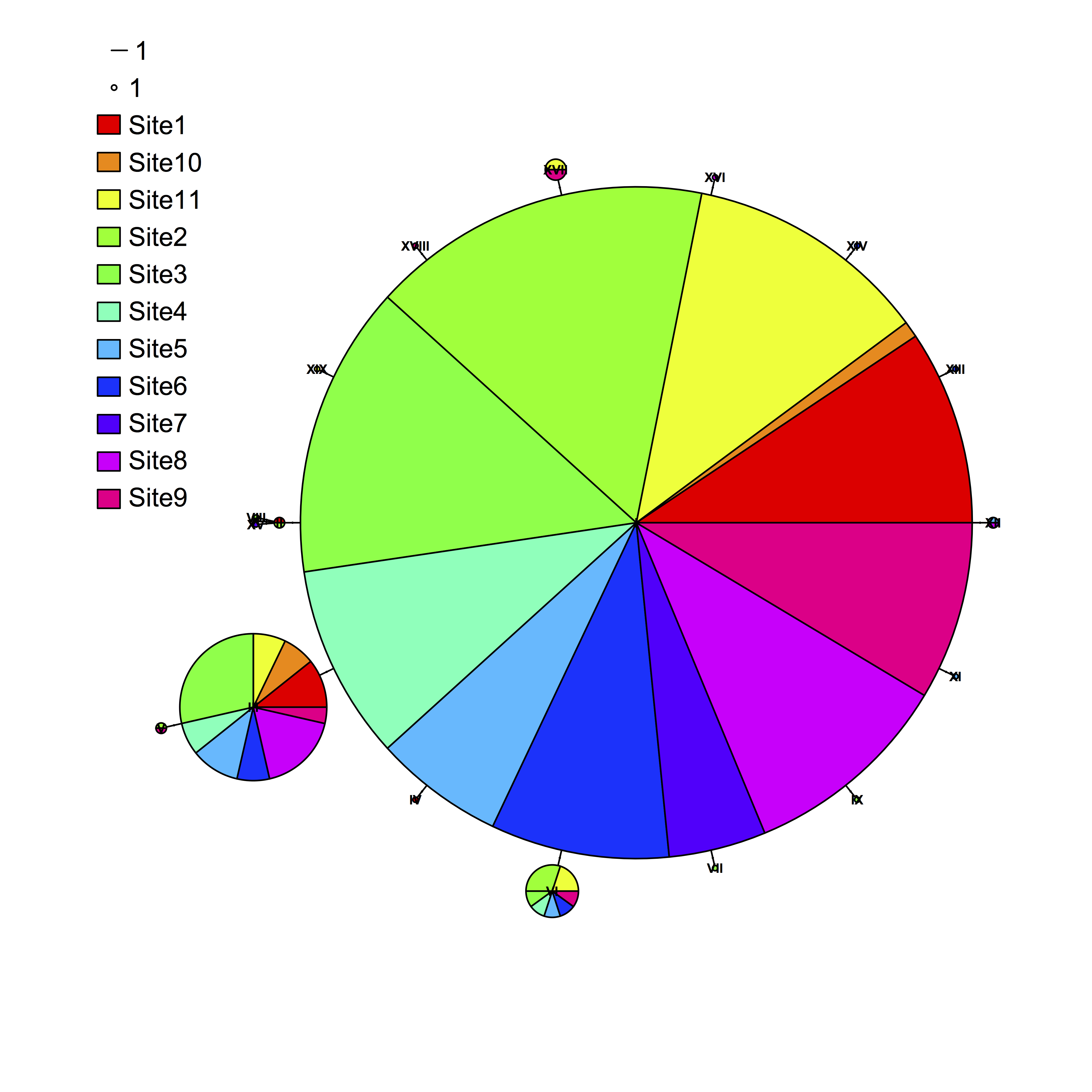
When plotting a haplotype network in R with the package pegas, the default legend can be pretty awkward. A user recently pointed out that at least in some cases, the colored legend circles are impossibly hard to see. Pegas does some porting of the generic plot function to plot haploNet objects, but the way in which it does so was not immediately obvious to me after a quick dig, and which does not permit passing of arguments to the function legend. I see two potential workarounds: (1) Suppress pegas’s plotting of a legend (legend=FALSE) and then plot a custom legend, or (2) plot bigger colored squares over the tiny dots given by the default plot. The second option was easier to rig up quickly, and avoids having to make sure the scale of the circle and line match up with the plot. To do this, I added the following lines to the existing code:
plot(net, size=attr(net, “freq”), scale.ratio = 3, cex = 0.5, labels=TRUE, pie = dc, font=2, fast=TRUE, legend=c(-100,90))

legend(-108,83, legend=rep(“”,11), fill=rainbow(11), bty=”n”, cex=1.2)
Which produced the following plot: