Interpreting Structure Plots
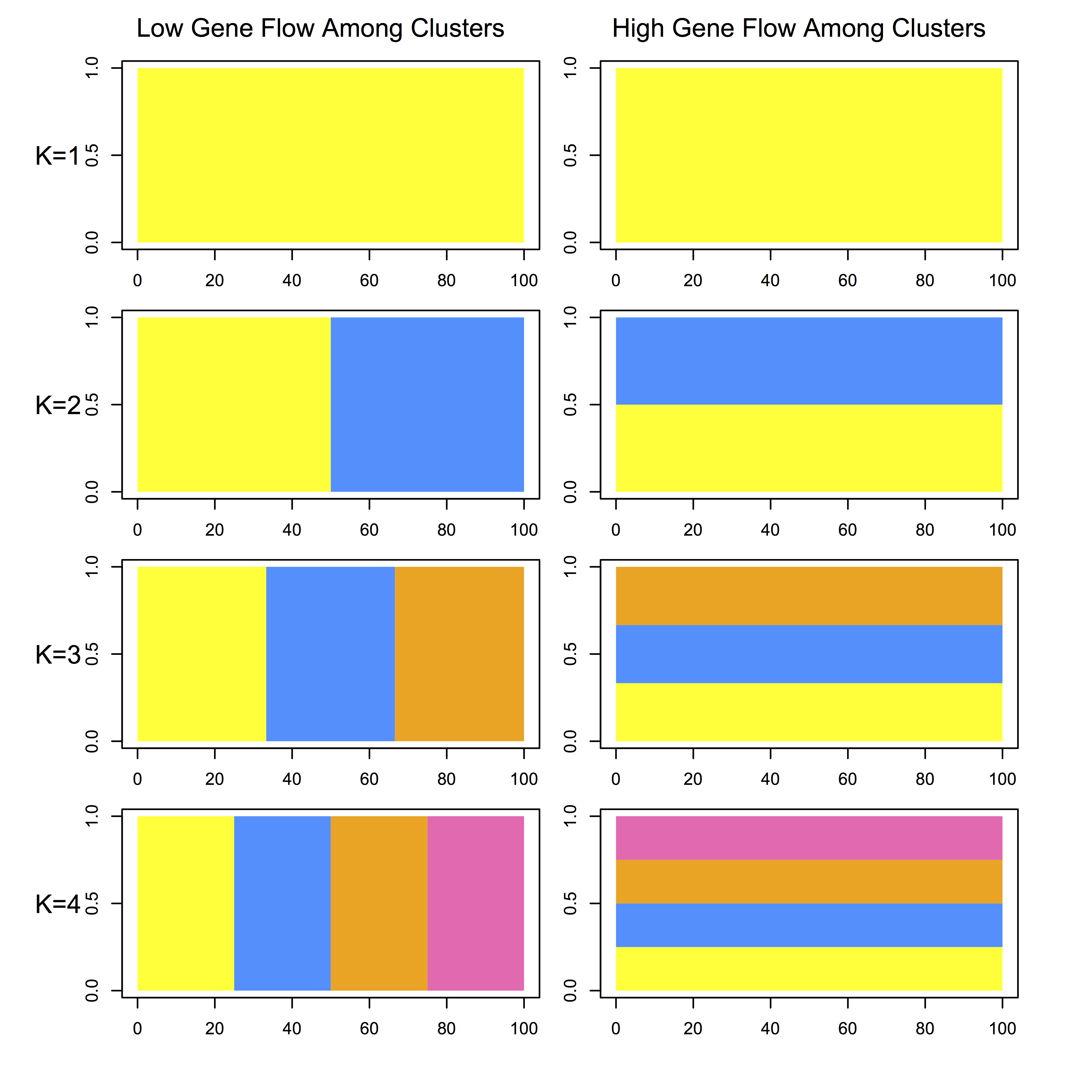
The software STRUCTURE is a useful tool for assessing population structure using genetic data from multiple loci. The typical way of visualizing its output is essentially a bar plot where each bar represents an individual, and the bars are filled by colors representing the likelihood of membership to each cluster. I think it usually takes looking at a couple of plots before one really “gets” what the plot is depicting, so in a presentation I think it is useful to walk the audience through the expected output under different scenarios. So, I wrote an R script to illustrate the expected output from structure where there is either high or low gene flow among clusters, for 1-4 clusters. Note that the plots do not represent the expectation of the output for the same data analyzed under each clustering scheme. You can find the code on my Github page here.